Epson Computer
Tip -Just My Type!
(Matching Font Styles to your Page Design)
By Barbara Kotsos
 For
project ideas and more, visit www.epsoncreativezone.com For
project ideas and more, visit www.epsoncreativezone.com
|
There
are instructions posted on our website about how to download fonts
from online resources. If you’re not already, I really recommend
you get familiar with the process, because there is a wealth of
great fonts to download for free from the internet. This is a
good thing because sometimes, your font choices really do make
the page! Once you’ve figured out your page’s color
and design, and placed your photos, the style of font that you
choose can really make or break your page.
At best, your fonts serve to enhance, and coordinate with your
theme. An article in a recent Memory Makers magazine said it’s
like picking just the right accessories to wear with a favorite
outfit. We can all relate to that! At worst, when fonts don’t
coordinate with the page or its theme, it can be distracting
-- or even cause confusion in terms of what exactly is your
page’s design theme.
Here’s where digital puts you at such an advantage over
traditional scrapbooking methods. Rather than be limited to
whatever die cuts you and your friends have collected over the
years, your choices are unlimited when you add use your computer.
We do know that even those scrappers who haven’t taken
the completely digital plunge do at least their journaling and
headlines using their computer.
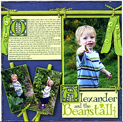
| I saw this page in the April 2007 issue of Memory Makers Magazine,
in an article about this very topic, and it’s the absolute
perfect illustration of what I’ m talking about. |
Look at how:
- the designer created an entire Fairy Tale design and
feel to the page,
- the journaling, by Diane Daffin, completely reinforced
that theme with the whimsical headline font,
- as well as the treatment of the first letters (“O”
on top, “A” down below),
- It all makes this page read like it’s from a favorite
fable.
|
 |
|
This page would not have worked nearly as well without this
choice of fonts.
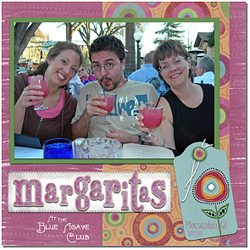
| Here’s another example: Katye did this page, of our
teachers and her. The very warm design and color scheme reflect
the margarita’s Southwestern origin. The font really picks
up on that design style, in color and typeface. |
 |
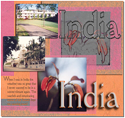
On this one, look at the font Brenda used here for her India
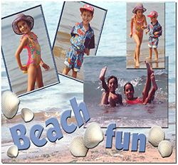
page headline, it looks Indian in design too she made this “Day
at the beach” page with a very playful font, in beachy
blue.
Sara used the perfect font selections for her pages. Again,
illustrating how nicely the right choice of typeface can tie
the whole page together and accessorize your page’s design.
So, if you haven’t discovered the reason yet to go digital
– here it is: for the unlimited choices of font styles
for the text in all of your pages. I can’t imagine anything
more compelling than that! Just give it a try! See if this is
your “type” of project!
For even more great information about selecting and downloading
fonts from the internet, visit PBS Scrapbook Memories website
and go to Project Series 400 and look for Project 406 –
Epson Computer Tips: How to Get and Use Great Fonts from the
Internet.
|
Barbara Kotsos
| Sponsor: Epson
America, Inc. |
|